
CASE STUDY
Garden Street Hub | Concordia Network
Ministry Branding
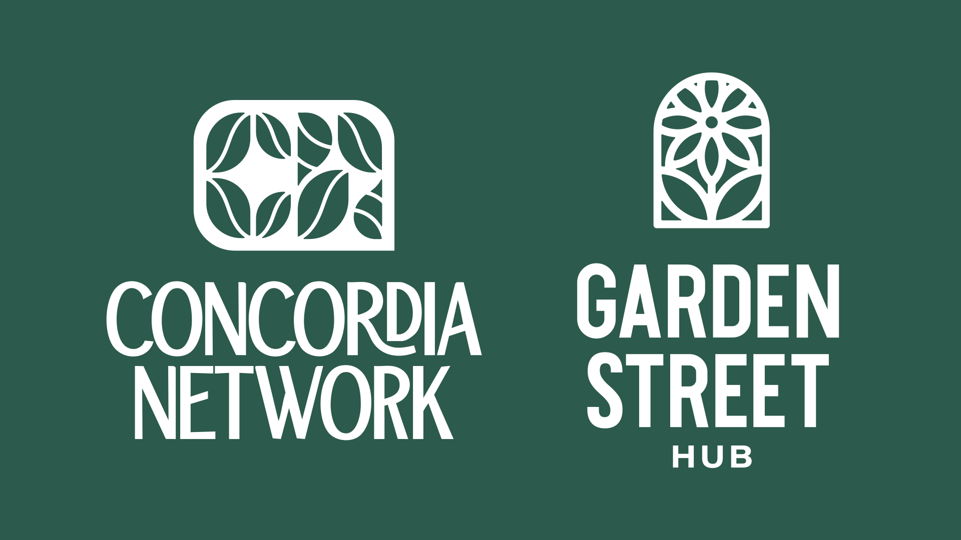
We developed two distinct ministry logos for sister ministries, giving each its own personality while reflecting their shared roots. The challenge was to create a cohesive visual identity that connected the two brands while allowing each to express its individual purpose.
Inspired by botanical forms, we took a fresh, unexpected approach to familiar imagery. Clean shapes and complementary design elements created professional, recognizable marks with a clear family resemblance. A range of color variations gives each ministry flexibility while keeping the sister brands visually connected.